Overview
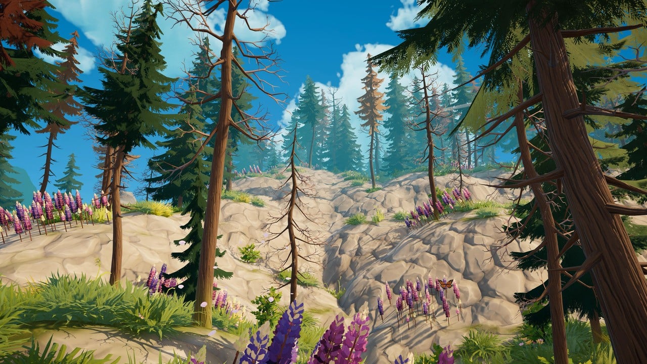
Outbound's art style and aesthetic are among the game's most immediately recognizable qualities. The visuals draw from the solarpunk genre, presenting an optimistic vision of a sustainable future where technology and nature coexist in harmony. The result is a lively, colorful world with soft lighting, gentle color gradients, and an almost painterly quality that has drawn comparisons to animated films.
The game is built in Unity 6 using the Universal Render Pipeline (URP), which provides the technical foundation for its stylized rendering. The look has been described as "Pixar-like" and "Firewatch-esque" in coverage, while the development team at Square Glade Games has been open about the specific real-world inspiration behind the game's visual identity.
Solarpunk Vision
Solarpunk is a genre and aesthetic movement that imagines a future where humanity has solved its environmental challenges through sustainable technology, community cooperation, and a harmonious relationship with the natural world. Unlike cyberpunk's gritty dystopias or steampunk's industrial nostalgia, solarpunk is optimistic. It envisions solar-powered cities, vertical gardens, renewable energy woven into daily life, and societies that prioritize ecological balance.
Outbound translates this philosophy into its world design. The game's setting is a future where sustainability is the norm rather than the exception. Sailboats dot the harbors instead of cargo ships. The player's camper van runs on an electric motor. Wind turbines and solar panels appear naturally in the landscape. None of this is presented as unusual or revolutionary within the game's world; it is simply how things work. This quiet integration of sustainable technology into everyday life is a hallmark of the solarpunk genre, and Outbound captures it without being heavy-handed.
The Dear Alice Inspiration
The primary visual inspiration for Outbound is Chobani's "Dear Alice" advertisement, a short animated film created by The Line animation studio and scored by composer Joe Hisaishi (known for his work on Studio Ghibli films). The ad depicts a young girl named Alice inheriting her grandmother's farm and transforming it into a thriving, sustainable homestead set in a lush, lively future.
Developer Tobi Schnackenberg, founder of Square Glade Games, has cited this advertisement as the starting point for Outbound's visual identity. The connection is visible in the game's color palette, character proportions, and environmental design. Both share a warmth and softness that feels more like an animated film than a traditional video game.
The "Dear Alice" ad itself drew heavily from Studio Ghibli's visual language, particularly films like "My Neighbor Totoro" and "Howl's Moving Castle." This Ghibli influence carries through into Outbound, giving the game a sense of wonder and gentleness that complements its cozy gameplay.
Visual Style
The game's visual style can be characterized by several distinct elements:
lively color palettecolors lean toward warm, saturated tones with pastel accents. Greens are rich, skies shift through soft oranges and pinks at sunset, and water reflects the surrounding environment with gentle color shifts.
Soft lightingshadows are not harsh or high-contrast. Light has a diffused, almost watercolor quality that reduces hard edges and creates a welcoming atmosphere.
Stylized character modelscharacters have a slightly cartoony appearance with rounded proportions and expressive faces. They are not photorealistic but are detailed enough to convey personality and emotion.
Environmental detailfoliage, rocks, structures, and terrain are rendered with care. Grass sways in the wind, leaves scatter, and the world feels alive without relying on photorealism.
Painterly qualitythe overall look has been described as resembling "a grand art piece." Scenes often feel composed, as if each camera angle was designed to produce a beautiful screenshot.
Lighting and Atmosphere
Outbound features dynamic lighting that changes throughout the day and night cycle. Sunrise and sunset paint the world in warm golds and soft pinks, while midday provides bright, even illumination. Night shifts the palette to deep blues and purples, with the van's headlights and interior glow creating a cozy contrast against the dark landscape.
Weather effects add further atmospheric variety. Rain darkens surfaces and adds reflections. Clear skies show off the full color palette. Overcast conditions soften the light even further, giving the world a muted, contemplative mood. These lighting changes are not just cosmetic; they affect the emotional tone of each play session and make the same locations feel different at different times.
Environmental Storytelling Through Design
The art style reinforces the game's sustainability message through visual details rather than explicit text. Sailboats in harbors suggest a world that has moved past fossil fuels. Solar panels on rooftops and wind turbines on hilltops are integrated into the scenery as natural fixtures. Gardens grow on vertical surfaces. These details tell a story about the world's values without interrupting gameplay.
Each of the game's biomes has its own visual identity that contributes to environmental storytelling. Coastal regions feel open and breezy, forests are dense and dappled with filtered light, and meadows stretch out in wide, inviting expanses. The consistent art style ties these varied environments together into a cohesive world.
The attention to visual storytelling extends to smaller details as well. The exploration experience is enriched by scenic overlooks, hidden groves, and carefully placed landmarks that reward players who take the time to look around rather than rushing through.
Awards and Reception
Outbound's visual presentation has been recognized by both press and players. The game won the gamescom CommUnity Choice Award, with its art style cited as a major factor in the win. Press previews have consistently highlighted the visuals as one of the game's strongest features, using descriptors like "gorgeous," "striking," and "one of the most beautiful games we've seen."
The art style has also been a significant driver of community interest. Trailers and screenshots regularly generate enthusiastic responses on social media, and the game's visual identity is a key part of what distinguishes it in a crowded cozy game market. The combination of solarpunk themes, Ghibli-influenced design, and high production values gives Outbound a visual identity that is immediately recognizable.
Award or Recognition | Context | Notes |
|---|---|---|
gamescom CommUnity Choice Award | gamescom 2025 | Voted by the community; art style was a major factor |
"Pixar-like" visual praise | preview | Compared to animated film quality |
"Firewatch-esque" comparisons | Recurring framing | Highlighting the stylized, painterly aesthetic |